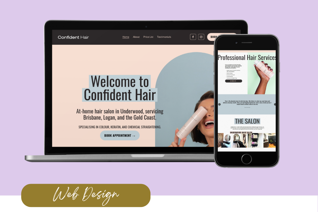
Simplify Your Website Navigation: Key Elements to Include
Your website’s top navigation bar is more than just a collection of links; it’s the roadmap to your site’s content and a critical component of your visitor’s experience. You want your new potential customers to know exactly where to go on your site, and to be able to do it quickly and easily. And a simple, but well organised, navigation bar can achieve just that. In this blog post, we’ll explore the essential elements (IMHO) that you need to include in your website’s top navigation bar to ensure a seamless and engaging user experience.

What Users Look for in Website Navigation
It’s important that we start by looking at your specific business - users for an e-commerce business versus a service-based business will have a different journey, and your website navigation should reflect that. So take some time to consider what people want to find when they visit your website. Typically, though, it’s the following:
What you do
Who you are
How to work with you or how to buy the product you’re selling
Free resources that a) help them and b) let them get to know you more
How to contact you
Optimise Your Website Navigation: Key Pages to Add
With this in mind, the below elements are a good example of how your top navigation bar should look:
#1. Homepage
The homepage link is a no-brainer, although many leave this out as a text link and instead make sure that their logo links back to the homepage.
Either way, this page is the main gateway to your website and often serves as the first impression visitors get. It’s the place where users typically start their journey, so you want to make it easily accessible by placing it prominently in your navigation bar.
Why it’s important: The homepage is your virtual front door, offering a snapshot of what you offer and guiding users to the other parts of your site.
Example: A simple “Home” or your site’s logo can serve as this link.
#2. About
The “About” page is where you tell your story. Whether you're an individual or a business, this page gives you the opportunity to share who you are, what you do, and why it matters. It’s a crucial element for building trust and creating a connection with your audience.
Why it’s important: Visitors often want to know who is behind the website, and this is the place to establish credibility and foster a personal connection.
Example: Use titles like “About Me” or “Our Story” to make this section inviting and personal.
#3. Services or Shop
If you are a service-based business, a “Services” or “Work with Me” page is essential. If you are a product-based business, a “Shop” page with all of your product collections would be your version of a “work with me” page. This page should clearly outline who you provide and how potential clients or customers can engage with you or buy from you.
Why it’s important: This is a critical touchpoint for converting visitors into clients or customers by providing them with the information they need to take the next step.
Example: “Services,” “What I Do,” “Work With Me”, or quite simply “Shop” are all clear and compelling titles for this section.

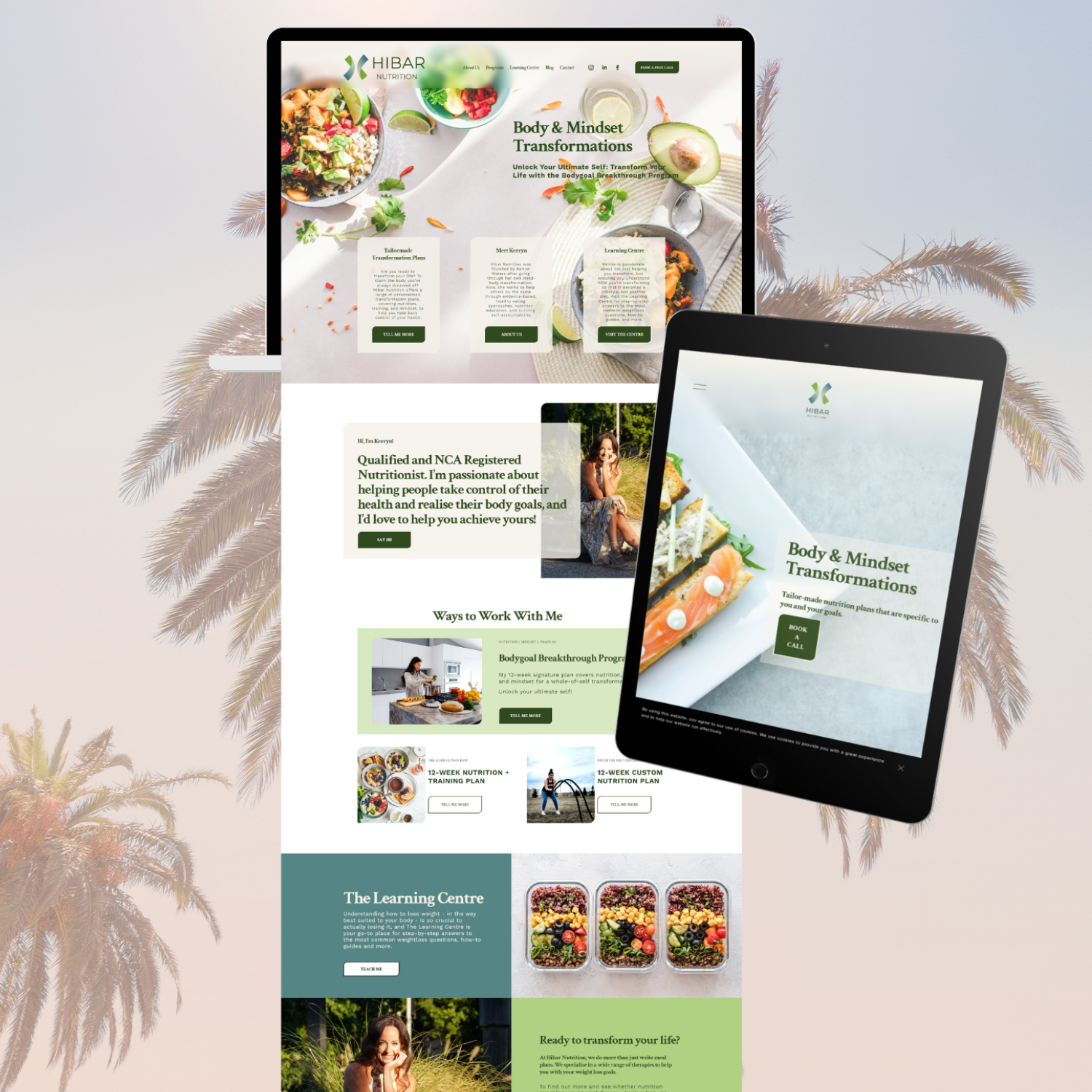
#4. Additional Resources
Whether it be a blog, a podcast, a Youtube channel, or any other form of additional content, if you have these types of resources available, you definitely want to link them in your main navigation. Regularly updated content helps with search engine optimisation (SEO) and keeps your audience engaged with fresh information. It also helps your audience get to know you more.
Why it’s important: This area not only provides valuable content to your visitors but also establishes you as an authority in your field, driving more traffic to your site.
Example: Label this section “Blog,” “Podcast,” or “Insights” depending on the type of content you provide.
#5. Contact
A “Contact” page is a must-have for any website. This is where visitors can reach out to you for inquiries, support, or collaborations. Ensure this page is straightforward and provides multiple ways for users to get in touch, such as through a form, email, or phone number.
Why it’s important: It provides a direct line of communication, making it easy for visitors to connect with you, ask questions, or start a conversation.
Example: Simply label this section “Contact” or “Get in Touch” to make it clear and accessible.
Additional Tips for Your Navigation Bar
Keep it Simple: Your navigation bar should be clean and uncluttered. Limit the number of items to what’s essential to avoid overwhelming visitors.
Use Clear Labels: Make sure the labels for each section are straightforward and easily understood. Avoid jargon or overly creative titles that might confuse users. These might seem like fun, but they just confuse.
Mobile-Friendly: Ensure that your navigation bar is responsive and works well on all devices, especially mobile. Consider using a hamburger menu for smaller screens to keep the design sleek.
Consistency: Keep your navigation consistent across all pages to help users know where they are and easily find their way back to important sections.
Highlight the Current Page: Use visual cues like a different colour or underline to indicate which page a user is currently on, helping them to navigate more effectively.
Use a Clear Font: make sure that your navigation is easy to read by using a font that is clear and simple. This is not the place to use a pretty stylised font. I prefer capital letters and a slightly larger spacing between letters.
The Good Stuff
A well-designed top navigation bar is key to a user-friendly website. By including essential sections like the homepage, about, services, blog, and contact, you provide visitors with a clear path to explore your content and engage with you. Remember to keep it simple, use clear labels, and ensure it’s mobile-friendly for the best user experience.
Now, over to you… chances are you’ve created new pages for your website since you initially created your navigation menu. So it’s time to take 5 minutes today to review your current navigation bar and see if there are any changes you can make to simplify it. Happy designing!